

Starting a Newsletter? That’s the easy part.
You can have the best content…
But your audience might never know about it and subscribe without well-crafted newsletter landing pages.
It improves conversions by providing visitors with a clear and compelling call-to-action without distractions.
Here’s a fun fact…
The average landing page conversion rate across multiple industries is between 2.35% and 4.02%.
Mine is 8.94% and my best performer.
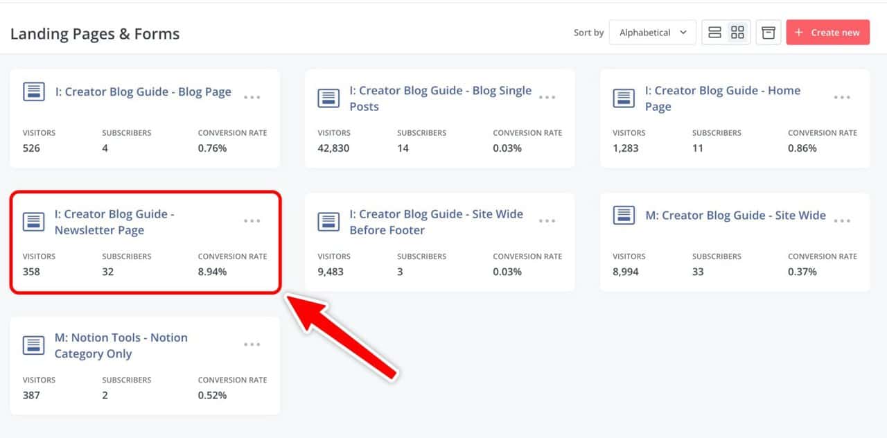
Compare that to all the other forms I have on other pages.
See how vital a dedicated landing page it is?
In this article, you’ll learn:
- The benefits of having one
- How to create a newsletter landing page to maximize sign-up conversions
- Other great newsletter landing pages
Let’s go.
What Is a Newsletter Landing Page?
A newsletter landing page is a website page specifically designed to encourage others to sign up for your newsletter or email list.
Site visitors should understand:
- What your newsletter is about
- Why they should subscribe
- What info to fill in to subscribe
Expectations should also be set from the get-go…
And they should learn the above immediately.
Links to a newsletter landing page can be placed in your social media bios (YouTube, Instagram, etc.) or your main website navigation bar.
It’s also one of the best mediums to convert visitors into subscribers.
Why Is a Newsletter Landing Page Important?
The idea is to direct visitors to a focused page.
And in marketing…
Context and personalization are vital if you want to maximize conversions.
These are the top benefits of having a newsletter landing page.
1. Reduced Distractions
Unlike a general page like the homepage…
A landing page reduces distractions by displaying only the necessary information pertaining to the campaign or offer.
This concentrated approach helps keep visitors on the path toward achieving the desired conversion goal.
That’s signups in this case.
2. Tailored Messaging
You can tailor your content to specific audiences and their interests.
That level of personalization will increase
- Engagement
- Relevancy
- Conversions
Your newsletter might be covering multiple different sub-topics under a main topic.
It makes more sense to serve different landing page copy to visitors with varying interests but the same ultimate goal.
You can have multiple versions…
And this allows you to segment and tag them using various newsletter platforms.
3. Optimize For Search Engine Optimization (SEO)
Landing pages have unique URLs and can be indexed on search engines…
This means you can optimize content for SEO to attract organic traffic.
Take mine, for example.
It’s https://brendanaw.com/newsletter
If someone searches on Google “newsletter”…
I might pop up.
It’s unlikely because that’s an extremely competitive keyword.
But if you have a niche-specific newsletter, you can brand it as: https://yourwebsite.com/[niche]-newsletter
4. Paid Advertising
Running paid ads is also possible because the page has a URL.
You can direct traffic from specific audiences on platforms like:
- Twitter/X
- Facebook/Meta
- TikTok
Rather than a general website page…
This ensures a seamless experience for visitors and maximizes the chances of converting newsletter subscribers.
5. Tracking And Optimization
You can analyze metrics such as click-through rates, conversion rates, and other key performance indicators specific to that page.
This lets you fully optimize every little detail leading visitors to the signup button.
That’s impossible when all you have is a link.
How to Create a Newsletter Landing Page
This page will give visitors everything they should know about your newsletter.
First impressions count…
So get it right.
Here are my tips on creating a landing page for your newsletter.
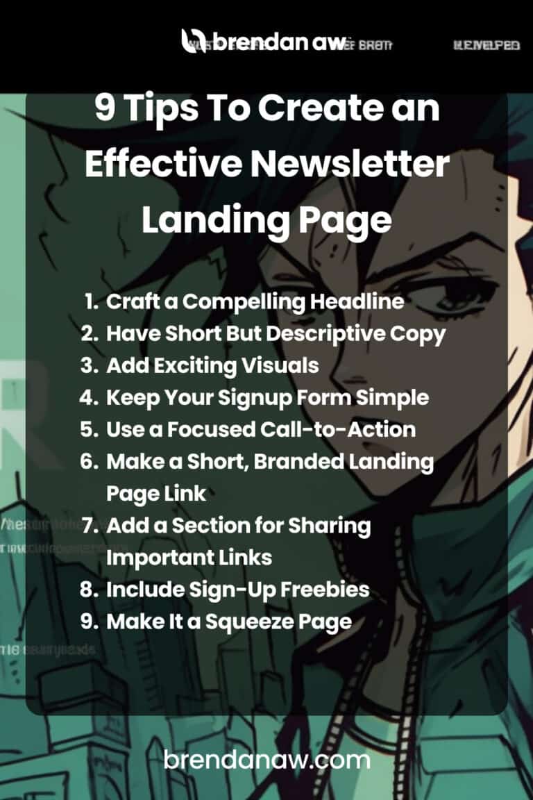
- Craft a Compelling Headline
- Have Short But Descriptive Copy
- Add Exciting Visuals
- Keep Your Signup Form Simple
- Use a Focused Call-to-Action
- Make a Short, Branded Landing Page Link
- Add a Section for Sharing Important Links
- Include Sign-Up Freebies
- Make It a Squeeze Page
1. Craft a Compelling Headline
Cut out the vague, generic headlines like “Check out my writing newsletter” or “A newsletter about travel and life.”
Your headline must be designed to grab your attention from the get-go. Give a hint of what your newsletter will be about in your headline.
Here are some things to keep in mind for generating a headline:
- Communicate benefits clearly. A clear and concise example is, “Boost your blog traffic with our weekly tips”.
- The more action-oriented it is, the more it nudges your audience into subscribing.
- Being witty is always a plus, but it’s not your main goal. Your goal should be to keep your audience from leaving without subscribing, so keep your headline simple and easy to read.
Remember: your headline sets the tone for the rest of the copy on your newsletter subscription landing page.
If it’s dull, most people won’t want to check out the rest, so take your time coming up with a punchy one.
2. Have Short But Descriptive Copy
Your newsletter sign-up landing page should give visitors valuable info about your newsletter and why they want to sign up for it.
Highlight the benefits of your newsletter using easy-to-skim language.
Ensure it’s all in short sentences so their eyes don’t glaze over from walls of text.
Don’t forget: avoid hard-sell language which may come off too pushy here. Save that for your CTA.
Stick to a few sentences that tell your audience more about what to expect when they sign up, how often you’ll send newsletters, and what topics you’ll cover.
3. Add Exciting Visuals
Let’s face it: people just find their eyes drawn more quickly to images or videos than long paragraphs.
Eye-catching visuals excite and appeal to emotions much faster than copy, too.
So don’t just add any photo you want to display – pick carefully and make the most of that page space.
Here are some tips for adding visual elements to your landing page:
- Just choose a few – don’t clutter it up with too many images.
- Choose photos that support your brand identity and newsletter content, so your audience has a better idea of what to expect.
- Make sure your images or videos are high-quality and load quickly.
- Don’t let your color scheme and images blend into each other. Try using contrasting colors so details pop off the page.
4. Keep Your Signup Form Simple
A long, complicated signup form will discourage people from subscribing to your newsletter.
Keep that newsletter signup simple. Collect only the necessary details to send your newsletter their way.
I strongly recommend just getting their email address and first name for starters.
I know it’s tempting to ask for other important info like their location, age, or last name. After all, these help you learn about your audience and what content they like.
As valuable as this info is, they may end up turned off or overwhelmed by filling more fields.
Give it a rest – you can always get this data later through other ways like surveys.
5. Use a Focused Call-to-Action
The words you use for your call-to-action button should be short but impactful. It’s the last little push on your email newsletter landing page that should move them to subscribe.
Don’t shy away from being a little hard-sell for your subscribe button CTA.
It doesn’t have to be complicated, but it does have to tell site visitors what they should do.
Some great examples of a focused call to action are “Join the club” or “Count me in!”
You can try adding a sense of immediacy by using words like “now” or “today”. Other successful newsletters use a longer CTA with a problem-solving approach, such as “Yes, I’m ready to take financial control”.
Experiment with different CTA variations that’ll make your audience want to subscribe.
Whichever you pick, it should hint at how your newsletter brings them a step closer to their goals.
6. Make a Short, Branded Landing Page Link
Don’t forget to make a shortened link for your newsletter landing page!
There are link shortener services like TinyURL or Bitly that can shorten your landing page link and even customize it.
Yes, you could always share the long link as it is, but it’s a missed opportunity. Here’s why you should get short custom links:
- They reinforce your creator brand and keep you top-of-mind. For example, you can use your creator name in a custom domain for your short link for better name recall.
- Short links are less spammy-looking, take up fewer characters, and are just plain neater to look at.
- You can track clicks on those links, telling you which pages and areas those clicks came from.
7. Add a Section for Sharing Important Links
Below your CTA subscription button on your landing page, you can add relevant links that tell your audience more about you and your brand.
Got a blog, podcast, or streaming channel? Add links to those there to make the most of your landing page.
If a visitor is on the fence about subscribing, clicking those links to see more about you and your work may convince them.
In the long run, a link section will increase your following across your other social media platforms and your subscription rates. So don’t waste the chance to add one to your landing page!
8. Include Sign-Up Freebies
One of the easiest ways to increase sign-up rates is to give away something your audience finds valuable.
Do you design wallpapers or fonts? Record instrumentals for background music?
Add access to a few of these for free to reward subscribers.
This convinces more people to subscribe to your newsletter and increases interest in your offer.
Giving subscribers a taste now…
And they’ll be more inclined to pay later when you monetize your newsletter.
Best of all, freebies establish your authority. They show the quality of your work and your level of expertise. Give a little now to gain a lot more later!
9. Make It a Squeeze Page
You probably never heard of this…
But a squeeze page is a type of landing page designed with psychological elements that “squeeze” visitors into giving their email addresses.
This means:
- A single call to action
- Little to no navigation links
- Minimal secondary information
The ultimate goal is ZERO distractions aside from signing up…
And starving the visitor of options.
Just take a look at my newsletter landing page for The Raw Baw.
You basically have nothing else to do besides signing up.
Sounds counterintuitive, right?
But it works.
Best Newsletter Landing Page Examples
Now that you know how to make an exciting landing page for a newsletter sign-up, it’s time to tweak yours and convert people into subscribers.
I chose ten of the best examples for a landing page for a newsletter made by small businesses and creators just like you.
Let’s break them down.
1. Payload
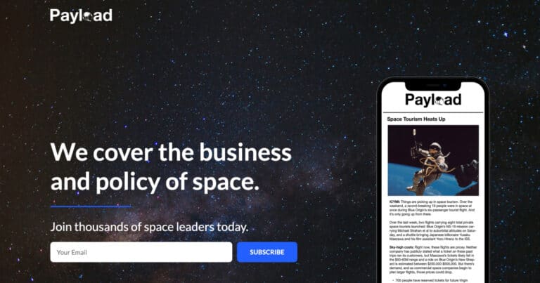
This industry newsletter landing page works well because:
- Their scrolling landing page has tons of social proof. They list important space organizations and top executives that read the newsletter.
- There are three simple, highly visible subscription fields. This gives site visitors multiple chances to sign up after looking at reviews and recent stories.
- “Join thousands of space leaders today” is also an excellent hook that directly connects with readers. It tells them they’ll be among the brightest and the best in the industry when they subscribe.
2. TDP Clothing
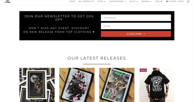
Why this clothing company’s newsletter landing page works well:
- The company offers a 20% discount to convince more site visitors to subscribe.
- The landing page also highlights new releases. This shows off the brand’s unique products and what subscribers can look forward to.
- The sign-up box is put front and center. It also only has two fields, so site visitors don’t get overwhelmed by having to fill in too much info.
- There’s also a button that takes site visitors to the rest of the shop. This gives them more content to look at to convince them, in case they’re still on the fence.
3. Copy Revival by Lizzie Davey
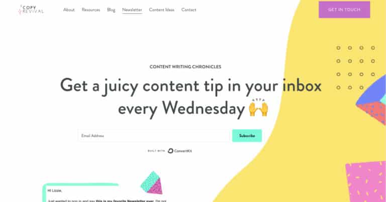
Why this creator’s newsletter landing page works well:
- It has a simple and straightforward headline. The headline directly states when the newsletter will be released and what benefits subscribers can expect.
- Its graphics are simple but eye-catching. The landing page has bold colors that look refreshing instead of distracting.
- For those who are on the fence, the “Learn More” button leads you to additional info about who runs the site and its resource catalog. This establishes the newsletter’s content value and its creator’s authority.
- As you scroll down, the page establishes the creator’s credentials and the resources she wants to provide to her target audience, like workshops. This further establishes authority and improves audience trust.
4. Milk Road
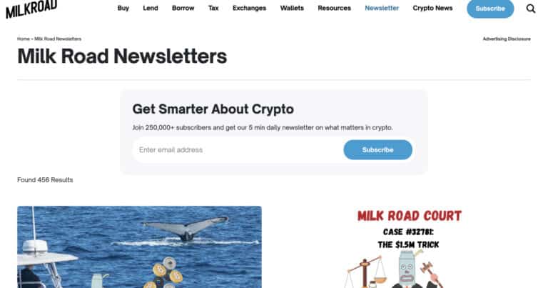
Why this crypto newsletter landing page works well:
- Its active headline directly states what benefits subscribers can expect – learning more about crypto.
- It has tons of social proof, citing organizations and industry leaders that read the newsletter. It also lists the number of subscribers it currently has.
- The page has useful and fun information that may convert the target audience, such as a “Fear and Greed Index” and product reviews. This gives visitors a glimpse of what the newsletter’s contents may be.
- It has two subscriber fields on the landing page, as well as a pop-up with a signup button when you first open the site. This gives visitors multiple opportunities to subscribe without having to scroll up and down the page.
5. The Publish Press
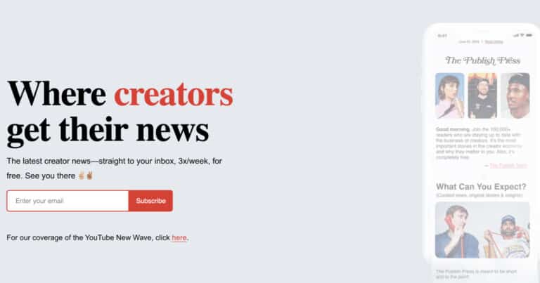
Why this industry newsletter landing page works well:
- Its headline creates a slight air of FOMO, giving off a vibe that if you’re a creator who wants to further your career, this is a newsletter that you can’t miss.
- The sub-headline tells visitors how often the newsletter will be released and what to expect in its contents. Setting expectations clearly will encourage visitors to sign up.
- Its graphics are simple and relevant, featuring its creators (YouTube influencers Colin and Samir) and social proof through its current subscriber count.
- It has a straightforward sign-up field that only requires one piece of information. This reduces the chance of losing a site visitor’s interest in subscribing.
- The simplicity of the landing page prevents site visitors from getting overwhelmed by too much text.
6. The Saturday Solopreneur by Justin Welsh
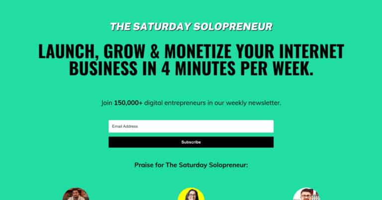
Why this creator newsletter landing page works well:
- Its headline directly lists the benefits that email subscribers will receive from the newsletter’s contents – that is, to launch, grow, and monetize their Internet business with tips from its 4-minute reads.
- It doesn’t shy away from listing a lot of social proof to further convert people into subscribers. It lists its current subscriber count in the sub-headline and cites glowing reviews from industry leaders and influencers.
- There are two simple sign-up fields that need only a site visitor’s email address.
- It places sign-up fields at both the top and the bottom of the page, so you don’t have to scroll to subscribe.
7. The Tilt
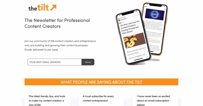
Why this industry newsletter landing page works well:
- The headline clearly states what its target audience is – professional content creators.
- Its sub-headline flaunts its current subscriber count. This establishes social proof that’s strengthened by many featured reviews below.
- Its sign-up form is simple, requires only one piece of information (an email address), and has a simple CTA, “I’m in!”
- Its featured photo shows a mobile phone with its newsletter contents. This allows site visitors to picture themselves reading the newsletter on their phone too, further hooking them in.
8. The Marketing Design Dispatch
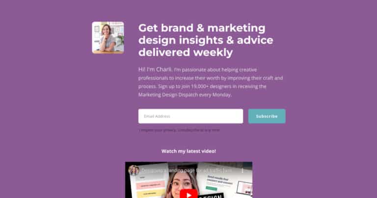
Why this designer’s newsletter landing page works well:
- This landing page doubles as a link page, with a section for store pages and other social pages like the designer’s main website. This helps expose potential subscribers to her brand. It also directs them to her other pages to boost site traffic and follower count.
- The headline sets expectations clearly and uses active language. It tells subscribers what the general content of the newsletter will be and how often they’ll receive it.
- The copy is short but warm and welcoming in tone. It cites how many current subscribers there and the aim of the newsletter creator. This helps site visitors learn more about her and her brand.
9. CoffeeCup
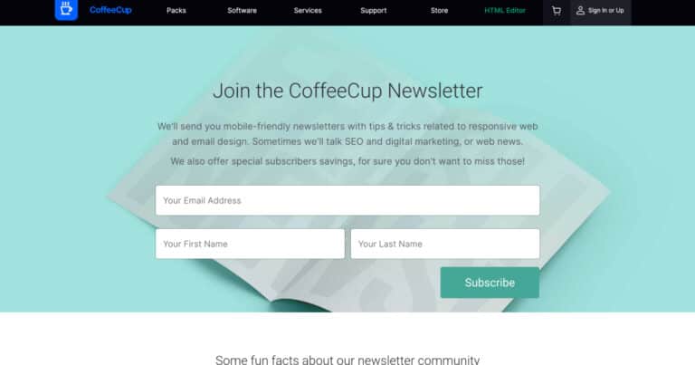
Why this business newsletter landing page works well:
- The landing page is simple and clean, with minimal imagery. This keeps it fresh to the eye and keeps visitors from getting bored.
- In the “fun facts” section of the newsletter, they include the subscriber count and further insights about the newsletter.
- Emphasizing a “no spam” philosophy tells site visitors that all its newsletters will be value-adding.
- The “special subscribers savings” offer promises discounts on their apps and services. Discounts and special offers are a powerful hook for site visitors.
- The sign-up form is simple and asks only for the first name, last name, and email address of subscribers. The fewer fields to fill in, the more likely a visitor is converted into a subscriber.
10. Overthink Group
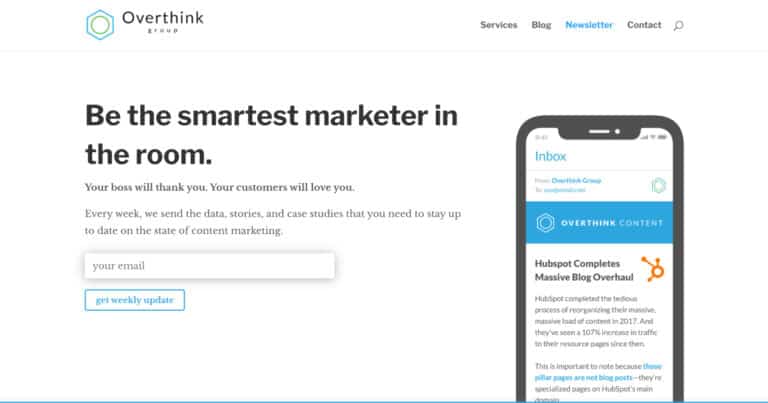
Why this business newsletter landing page works well:
- The headline’s value proposition is clear, immediate, and engaging.
- Statements like “Your boss will thank you” and “Your customers will love you” give visitors a nice way to visualize benefits without using complicated buzzwords.
- The copy sets up expectations well, saying you’re going to receive the newsletter weekly. It also gives a glimpse at what kind of content subscribers will receive.
- The CTA of “Get weekly update” is simple and says exactly what happens when you subscribe.
- The only field you need to fill in is your email address. Requiring less info nudges visitors to subscribe.
Newsletter Landing Page (FAQs)
Is a Landing Page the Same as a Homepage?
No, a newsletter landing page is not the same as a homepage.
However, many creators and businesses use their homepage to double as a newsletter landing page. It saves time and effort since they already have a website.
Others set up a newsletter landing page even though they don’t have a website yet. This helps them gain subscribers while they’re setting up their main site.
Should I Still Set Up a Landing Page if I Already Have a Main Website?
Yes, you should still set up a landing page for your newsletter even if you already have a main website.
Having a separate landing page eliminates distractions. It also keeps unrelated content from boring potential subscribers.
This increases your conversion of site visitors to signed-up readers.
How Much Information Should Be on a Newsletter Landing Page?
our newsletter landing page should contain enough information to convince visitors to subscribe.
These should include:
• What is it about
• Why they should subscribe
• A signup form
Too much information can overwhelm them and discourage sign-ups.
Keep details to the bare minimum but compelling enough for a signup.
How Many Calls to Action Should I Have on My Newsletter Landing Page?
Your newsletter landing page should have only one call to action.
Too many CTAs can confuse or distract site visitors.
This increases the chances of them doing nothing and leaving your site.
To Sum Up
Now that you know the secrets of a successful newsletter landing page…
It’s time to make your own and start gaining subscribers.
Remember to get to the point and convince your audience to sign up now.
If you like this article, share it and tell me how it’s helped you get more subscribers!